 Article about Archery Battle 3D
Archery Battle 3D Review: Sharp Aiming, Unclear Feedback
Archery Battle 3D makes its case in the brief hush before a shot: a target waits, the bow is drawn, and a small movement of your thumb can turn a clean hit into a miss. That tension is the game’s best design idea, and much of its appeal comes from making a simple action feel consequential. Its weakness is that the interface is less disciplined than the aiming itself. The central interaction is legible; the surrounding menus, match information, and post-shot explanations can leave you working out the rules while the game expects you to focus on the wind.
This is a sports game with an unusually narrow center of gravity. You aim, account for conditions, release, and watch the arrow’s path decide whether your judgment was good enough. The loop is easy to grasp and satisfying to repeat, especially when a close contest makes every shot feel like a small calculation under pressure. But interaction design is not only the moment of release. It is also how clearly the game prepares you for that moment, tells you what happened, and helps you recover when you make a mistake. On those terms, Archery Battle is compelling but uneven: tactile where it matters most, less clear everywhere around it.
A duel organized around one excellent decision
First-use orientation: the target explains the fantasy, not every rule
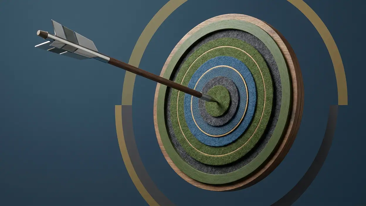
The first impression is direct. A bow, an opponent, and a target communicate the sport without a tutorial paragraph insisting on what is already obvious. That restraint is welcome. The player can read the basic objective at a glance, and the oversized target gives the screen a strong visual anchor. Your eye knows where the important action will happen before your thumb has to do anything.
The trouble begins once the game asks for more than a basic aim. A novice needs to understand how dragging translates into the bow’s direction, how environmental conditions affect the arrow, and what information should influence a shot. The game introduces these ideas through play, which suits the quick-match format, but its orientation can feel more like exposure than instruction. You learn by trying, yet the interface does not always make clear which part of a result was caused by your input and which by the conditions.
That distinction matters because archery depends on informed adjustment. A miss can be useful if the game makes its cause readable; otherwise it is merely a miss. The target is visually clear, but the path from “I aimed here” to “the arrow landed there” needs equally clear explanation. New players are given a strong invitation to act, but not always enough context to interpret the outcome. The game trusts curiosity, and that trust gives the opening pace, while also risking avoidable confusion.
Navigation and hierarchy: the match owns the screen
Inside a duel, hierarchy is at its strongest. The target and aiming area dominate, while supporting information sits around the action. This is the right instinct for a game whose central challenge is visual judgment. The screen does not need to compete with the target for attention, and the act of drawing and adjusting feels like the obvious next step. When the match is underway, the design mostly keeps its promises: look, aim, release, assess.
Outside the shooting moment, the hierarchy is less convincing. Menus and progression choices have to explain what kind of activity comes next, what the player has earned, and which option is worth tapping. Those transitions can feel like separate layers rather than one continuous route into play. The match has a clear focal point; the surrounding structure does not always provide an equally clear next step. A player who wants another duel can usually find the way forward, but the game is less graceful when the player pauses to inspect choices or understand progression.
This is not a demand for elaborate navigation. A sports game benefits from getting out of its own way. The issue is that speed and clarity are not the same thing. A compact menu can still make the most relevant choice visually obvious, label unfamiliar options plainly, and keep rewards connected to the next action. Archery Battle’s match screen understands hierarchy as focus. Its broader interface sometimes treats hierarchy as a collection of available things.
Feedback after actions: the arrow gives a result, not always a lesson
The shot is the game’s most persuasive feedback loop. You make an adjustment, release, and follow the arrow to its destination. That brief flight gives the action weight: there is a visible connection between your decision and the result, even when the outcome is disappointing. A well-placed shot feels earned rather than granted by a hidden stat, and a near miss naturally invites another attempt. Few parts of the game need more ornament than that.
But the result and the explanation are different jobs. An arrow landing outside the center tells you what happened; it does not necessarily tell you what to change. For learning to feel satisfying, the game should help distinguish an under-aimed shot from an overcorrection, or a poor adjustment from a condition you failed to account for. When that information is subtle, the player has to reconstruct the cause from memory. In a short match, that can turn an interesting challenge into guesswork.
The emotional feedback also depends on the score and the opponent. A close result can make a modest hit feel dramatic, while a comfortable lead can make the same action feel routine. That changing pressure is good pacing, but it puts more responsibility on clear visual communication. The game should make it easy to connect a shot to its effect on the contest. When that connection lands, the duel has a tidy rhythm: prepare, commit, watch, compare. When it does not, the score becomes a verdict without enough evidence.
There is a strong design opportunity here. Feedback need not be a lecture or a stack of numbers. A restrained cue that distinguishes a useful correction from a lucky outcome would make practice feel more intentional. The existing shot animation supplies drama; a little more interpretive clarity would supply learning. That would not make the game easier so much as make improvement feel more honestly earned.
Friction and recovery: a missed shot should not strand the player
Archery is built on small errors, so recovery is part of its basic grammar. A player should be able to recognize a mistake, make a measured correction, and try again without losing their sense of control. The game supports recovery through its quick, repeatable turns: a bad shot is not a long-term commitment, and the prospect of another attempt is usually close at hand. This is a real strength. The short loop keeps failure light enough to invite another match.
Still, the experience could do more to separate recoverable error from interface uncertainty. If a drag does not produce the expected aim, the player needs confidence that the gesture registered and a clear sense of the current orientation. If a shot goes wrong, the next attempt should feel like a fresh decision rather than a frantic attempt to undo the last one. Any ambiguity in the control or environmental readout makes recovery harder because the player cannot tell whether to repeat, reverse, or rethink.
The cost is not catastrophic, but it changes the mood. A clean failure can be motivating; an unexplained failure feels arbitrary. Likewise, a menu detour is tolerable when the route back to a match is obvious, but irritating when the player has to re-establish context. The game is at its best when it treats a mistake as part of the contest. It is weaker when the interface makes a mistake feel like a misunderstanding of the interface itself.
Good recovery design would preserve the immediacy while reducing that uncertainty. Keep the last relevant aiming context visible where appropriate, make the effect of a control unmistakable, and ensure that the route into another attempt is consistent. These are small choices, but they protect the game’s most valuable quality: the feeling that the player, not the menu, is responsible for the next shot.
Consistency across the experience: the sport is coherent, the wrapper less so
The core interaction has a recognizable logic. The player judges the target, makes an adjustment, releases, and reads the consequence. That sequence gives the game a stable identity, even as opponents and match situations change. The visual emphasis stays connected to the sport, and the basic act does not need to be relearned every time the player returns. That consistency is what makes the game easy to pick up for a short session.
The surrounding experience does not always share that precision. A strong sports interface carries a consistent vocabulary across match, reward, and progression screens: the same priorities remain visible, and actions mean what the player expects them to mean. Here, the shooting experience feels more carefully considered than the connective tissue around it. The contrast is noticeable because the central mechanic is so focused. When the match tells you to concentrate on a single decision, a less coherent transition afterward feels like a break in the design rather than a change of pace.
That contrast also clarifies what Archery Battle is not trying to be. It does not need the sprawling character-management structure of Star Wars: Galaxy of Heroes, or the open-ended social play of PK XD. Its appeal is closer to a compact sports challenge than to a broad virtual world. The comparison is useful only in showing why simplicity should be an advantage here: fewer systems mean the route between aiming, learning, and replaying should be especially easy to read.
Small-screen decisions: thumb-sized tension, limited room for explanation
Archery is naturally suited to a phone. A drag gesture turns the screen into a direct aiming surface, and the target gives the thumb an immediate purpose. The player does not have to translate a complicated button layout into the action. This physical simplicity suits quick sessions and makes the game feel more like handling a small instrument than navigating a control panel.
But touch screens have a trade-off: the same surface must show information and receive input. The aiming area needs space, while wind, scoring, and match context need enough room to be legible. If supporting details are too small or visually secondary, players may ignore them not because they are unimportant but because the screen has made them easy to miss. That is a particularly sharp problem in a game where environmental judgment may matter as much as the gesture itself.
The design should protect the target without burying the clues that make aiming meaningful. A well-placed information cue can sit near the action without competing with it; a cluttered overlay can make the player choose between seeing the conditions and seeing the target. Archery Battle’s central composition points in the right direction, but the small-screen challenge is not solved simply by making the target large. The supporting information needs a clear order, readable scale, and enough separation from the thumb’s active zone to avoid accidental interference.
There is also a useful lesson in restraint. Unlike a keyboard game such as Piano - Music Keyboard & Tiles, where dense input is the point, this game should not ask the player to manage a row of controls. Its best mobile decision is to keep the physical action simple. The harder task is making the surrounding information as effortless to read as the bow is to draw.
Expert-user observations: mastery needs room to become deliberate
Once the basic action feels familiar, the design question changes. A newcomer asks, “How do I shoot?” An experienced player asks, “What did that last shot teach me?” The game’s replay value depends on whether repeated matches continue to reveal useful distinctions: a more controlled adjustment, a better read of conditions, or a more patient choice under pressure. The core mechanic can support that kind of mastery because it is simple enough to invite fine judgment.
Yet mastery is hard to sustain if the interface obscures the relationship between technique and result. Players can still develop intuition through repetition, but intuition built on incomplete feedback is difficult to refine. A skilled player wants to know whether a tighter group came from a better decision or a favorable circumstance. They want the game to reward intentional control, not merely the confidence to keep tapping through matches.
This is where the game’s loop has both its strongest hook and its ceiling. A match is short enough to make another attempt appealing, and the single-shot focus gives each attempt a clean point of comparison. That is excellent replay scaffolding. But replay alone does not guarantee depth. The experience becomes richer when each rematch changes the player’s understanding; otherwise, the loop risks settling into a sequence of similar gestures with results that are dramatic but not fully diagnostic.
Expertise also changes how players read friction. Beginners may accept a vague cue as part of learning; experienced players notice when the interface withholds a distinction they need. They are more likely to test the limits of the controls, compare similar shots, and expect stable behavior between screens. For them, small inconsistencies become part of the challenge whether the game intended them to be or not. A refined design would make the challenge come from archery rather than from interpreting the interface.
The strongest design choice: a shot is a complete little story
The game’s best decision is its commitment to the shot as a self-contained event. The player prepares, acts, watches the arrow travel, and sees the contest shift. That sequence has a beginning, a moment of uncertainty, and a result. It gives each turn enough ceremony to feel important without slowing the match into a simulation. This is the design’s emotional engine, not just its control scheme.
That little story is why a simple round can hold attention. The pause before release creates anticipation; the flight delays the answer; the landing resolves the question. There is room for both confidence and doubt in those seconds. The game does not need a complicated progression system to make the next shot matter. It already has a compact dramatic structure inside the action.
The strongest way to improve the experience would be to make the rest of the interface respect that structure. Before a shot, help the player orient. During it, preserve a clear view of the target and relevant conditions. After it, show enough consequence to support a better next decision. Then make the next attempt easy to reach. That would turn the existing rhythm into a complete learning loop rather than a good action surrounded by occasional uncertainty.
Final design verdict: focused play, uneven guidance
Archery Battle 3D succeeds where its identity is most concentrated. The aim-and-release interaction is immediate, the arrow’s flight gives each turn a satisfying beat, and quick rematches make the game easy to revisit. It understands that mobile sports play needs a strong gesture and a clear moment of consequence. When the duel is flowing, the phone feels like a natural place for this particular contest.
Its design is less assured when it has to explain, organize, and teach. First-use orientation could make the rules of a shot easier to interpret; navigation could give the next useful action a clearer priority; feedback could distinguish a bad decision from an unexplained result. These are not calls for more features. They are calls for sharper communication around the feature that already works.
The verdict is a focused, enjoyable archery game with a genuinely tactile core and a user experience that does not always match its own precision. Its best moments come from trusting the player with a difficult shot. Its missed opportunity is not giving that player quite enough information to understand why the shot landed where it did. If you want a quick sports duel built around thumb-led aiming and repeatable tension, the game has a strong case. If you expect polished guidance from first launch through mastery, expect to supply some of that clarity yourself.